Modern Paint Color Trends of 2025
Freshening up a room with new paint can totally change its vibe without needing a big renovation or spending a ton. Whether you’re daydreaming about a cozy living room, a motivating home office, or a modern kitchen, picking the right paint color sets the mood instantly. I’ve spent plenty of time exploring color decks, testing swatches on my own walls, and checking out tons of gorgeous interiors online, so I want to share some super handy interior paint ideas, plus a good dose of inspiration, for anyone aiming to update their space.
Tastes change fast in home design, and lately there’s been a big switch up from cool grays and all-white walls. Over the past year, I’ve definitely noticed more earthy tones landing on walls, softening spaces and adding depth. Warm beige, taupe, clay, and greige paints are popping up everywhere. They bring a really chill, welcoming feeling, much less sterile than some of the icy grays from a few years ago.
Alongside those neutrals, deep greens, muted blues, and terracotta are widely loved right now. These colors lean into natural inspiration and pair well with wood, leather, linen, or stone. If you’re bold, moody colors like black, stormy blue, and dark olive are being used on all four walls in rooms like dining rooms or offices. These shades make spaces feel super cozy, especially with warm lighting.
Paint companies update their trending palettes each year, and for 2024, brands like Sherwin-Williams and Benjamin Moore are betting big on colors like forest green, warm brown, and buttery off white. The move away from gray is definitely gaining traction as people want more inviting and interesting spaces.
Classic Paint Colors That Always Work
While trends come and go, some colors just never look dated. Crisp white is the go-to for anyone wanting a clean palette. It lets art and decor pieces pop and gives any sized room an airy feel. Shades like Benjamin Moore’s “Chantilly Lace” or Sherwin-Williams’ “Pure White” are favorites for a reason. They suit almost any style and create a timeless base that makes switching up decor pieces a breeze.
Soft beige, pale graybeige (greige), or very light taupe are staples that stick around season after season. These shades feel warmer than plain gray but still stay neutral for easy decorating. Navy blue is another classic, especially for cabinets or feature walls—bold enough to stand out, but timeless enough that it rarely needs repainting. Whether you love traditional or modern styles, these foundational shades help make a room feel pulled together for years.
One of my all-time favorite classic looks is a light sage or dusty green. It’s gentle, subtle, and works in both vintage and modern homes. If you want something that’ll look just as good five years from now as it does today, these classic options are worth checking out.
Choosing the Right Paint Finish
Color is a big part of the decision, but finish matters too for both looks and durability. Here’s a breakdown I use when tuning in on which sheen to pick for different rooms:
- Flat/Matte: Best for ceilings and low-traffic rooms where you want minimal light bounce and a soft, velvety texture. Not the best choice for spots that need frequent cleaning.
- Eggshell: This finish has a slight sheen and works just about anywhere. It’s easy to wipe clean but still hides wall flaws a bit. Bedrooms, living rooms, and hallways look great with eggshell paint.
- Satin: Has a gentle shine that’s kid and pet friendly. It’s super popular for kitchens, bathrooms, and trim since it cleans up easily.
- Semigloss/Gloss: Super shiny and durable, perfect for doors, cabinets, and baseboards. These finishes show every little flaw, so walls need to be really smooth before you use them.
I usually go with eggshell or satin for most rooms—they’re versatile and easy to keep looking fresh. Plus, both finishes hide imperfections a bit better than glossier sheens and clean up easily when needed.
Easy Ways to Use Color Creatively
Wall paint doesn’t always mean a single color from floor to ceiling. Some of the coolest interiors make use of paint in less obvious places:
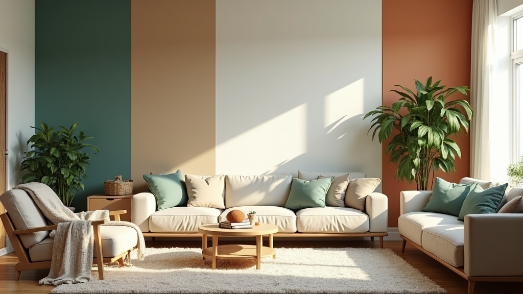
- Accent Walls: Painting just one wall in a bold color is an easy way to add drama without overwhelming the room.
- Color Blocking: This trend has caught fire with DIY fans. Paint half the wall, a wide stripe, or a geometric shape in a contrasting shade. This trick helps define spaces, especially in open-plan homes or lofts.
- Ceiling Paint: This one’s a game changer. Sky blue, deep plum, or even a crisp white that’s a shade lighter or darker than the walls can make your ceiling feel intentional, not like an afterthought.
- Doors and Trim: Instead of always going with white, try a soft grey, charcoal, or navy. It instantly gives the space a tailored, finished look. I’ve seen awesome results with sage green inside doors too!
- Cabinet Paint: Give outdated cabinets new life with color—deep green, blue-black, or creamy off-white can seriously upgrade a kitchen or bathroom without a major remodel.
- Built-ins: Bookshelves or window seats painted an unexpected shade really stand out as features in a room instead of blending into the background.
Getting creative doesn’t have to be stressful. With some painter’s tape and a willingness to check out new shades, it’s easy and fun to create a unique look, even on a tight budget.
Paint Colors That Take Your Mood Up a Notch
The color you surround yourself with can really affect how you feel in a space. For home offices, I always look for motivating colors. Earthy greens and deep blues help with focus and clarity—there’s something calming about them, but they don’t put me to sleep.
If you want a space that keeps your energy up, check out warm yellows, coral, or a vibrant turquoise. These shades crank up the productivity vibes and make spaces feel lively. For chill-out zones like bedrooms or reading nooks, soft lavender, pale blue, or gentle sage help me relax at the end of the day. Pale neutral tones also work for relaxation, giving a sense of calm and space.
There’s been some cool research on color psychology. Blue can boost concentration, while yellow sparks optimism and creative thinking. The trick is to choose shades you actually like rather than just following any trend. Everyone reacts a bit differently, so taking a few swatches home and seeing them in your own lighting can make a real difference.
Virtual Visualization: Apps to Try Before You Paint
Choosing a paint color from a little sample can be so tricky. If you’re like me and dread repainting when the color looks off on your walls, virtual paint apps can be a game changer. Here’s a handful of options that let you see colors in your actual space before you buy paint:
- Sherwin-Williams Color Snap Visualizer: This lets you upload a photo of your room and test out paint colors right on your device. Their database uses real paint shades from the store.
- Benjamin Moore Color Portfolio: This app brings AR into play so you can preview thousands of shades on your walls live. It’s accurate and really helps speed up the decision making.
- Dulux Visualizer: A great choice for tinkerers. Tap and paint different sections of your walls with a swipe, perfect for checking out color blocking and accent options.
- Home Design 3D: If you want to go big, this one lets you build and paint entire house layouts. Handy for figuring out how spaces can flow together visually.
Most of these apps are either free or offer free trials, so it’s definitely worth a try before you open a paint can or commit to any shade.
Painting Tips for Great Results
I’ve made my share of rookie mistakes, and the prep work always feels like a hassle, but it honestly makes the difference between DIY and pro-level results. Here are my top tips for painting like you mean it:
- Test swatches on the wall in several places since light in the room changes how color looks across the day.
- If you’re painting over a dark color or fresh drywall, use a primer first!
- Painters tape is your best friend for sharp lines. Remove the tape before paint fully dries for the crispest edges.
- Put some money into decent brushes and rollers. Cutting corners here usually leads to streaks and frustration.
- Work from the top down: start with the ceiling, then move to the walls, then the trim and doors last for a neater job.
- For a small room, lighter colors usually make it feel bigger. Dark shades make larger rooms feel cozy or add drama in tiny spots if you want the cocoon effect.
Spending time on prep, taping things off, and using quality painting tools keeps your space looking sharp and makes the job last longer. No one wants to see roller marks every time the sunlight hits the wall.
Interior Paint: Real-life Ideas for Every Room
Seeing real-life color combinations helps spark great ideas. Here are some suggestions and color pairings for a variety of rooms—ones that lots of people are loving right now:
- Living Room: Go for soft taupe or greige on most walls with a deep navy or charcoal accent. For extra coziness, try mixing muted green and blush pink accents.
- Kitchen: White or cream walls are classics, but you can paint lower cabinets or your island in deep blue, sage, or hunter green for a fresh feel. Pale gray or sky blue upper cabinets are also stunning in modern spaces.
- Bedroom: Light lavender or gentle sage on the walls, paired with white trim, is super relaxing. For bigger mood, deep teal, navy, or charcoal from top to bottom creates a retreat-like vibe.
- Bathroom: Crisp white or aqua is always good for a clean spa feel. Or go for a bold pop with black, emerald, or blush pink.
- Home Office: Soft blue gray, warm beige, or olive green keep energy up without being too distracting. Painting built-ins in a slightly lighter or darker shade adds subtle interest.
- Entryway: To make a statement, try rich charcoal, dramatic teal, or warm terracotta. Since entryways are usually small, it’s easy to go bolder than you might elsewhere.
If you want more inspiration, check out photos online of rooms with similar lighting or layouts—sometimes that can spark an idea you may not have considered!
Budget Friendly Ways to Refresh with Paint
Paint is one of the least expensive ways to totally upgrade a room, but you can stretch every dollar with some creative strategies:
- Paint window frames, radiators, or just furniture instead of the whole room. Little splashes of color can make a big statement.
- Use leftovers from previous paint jobs to color block your closet insides or pantry, or add color behind bookshelves for a subtle detail.
- Try two tone walls—use a deeper color on the bottom and a lighter one on top to mimic fancy paneling without the extra cost.
- Stencils are your friend! Use a reusable one to paint patterns on accent walls, doors, or even floors. It’s a cheap way to get a wallpaper effect without the price tag.
Mixing paints you already have, borrowing from a friend, or trading leftovers can lead to truly original looks, giving your home a unique vibe no one else will have.
Frequently Asked Questions
What color is replacing gray?
Answer: Warmer neutrals—think greige, taupe, warm beige, and earth-inspired shades—are moving into the spotlight. Deep green, rich brown, and muted clay tones are all getting more popular as people look for spaces that feel comfortable and welcoming.
Is there an app to virtually paint your house?
Answer: Absolutely! Some top picks include Sherwin-Williams Color Snap Visualizer, Benjamin Moore’s Color Portfolio, and Dulux Visualizer. Each helps you picture how a color will look in your space before you ever pick up a brush.
Which color never goes out of style?
Answer: Crisp white, soft beige, and navy blue have always stayed in style. Light grays and gentle greens work too if you want a look that lasts without feeling plain.
What paint color makes you most motivated to do work at home?
Answer: Calm but energizing shades like blue, green, or a warm beige work perfectly for home offices. Soft blues help keep your focus, greens are calming, and beiges create a distraction free background. For creative energy, a pop of yellow or coral can also liven things up!
Interior Paint Makes a Huge Impact with Minimal Hassle
Picking the right paint color sets the tone for your everyday life. With so many shades and creative approaches out there, it’s easy to put your personal stamp on any space. Whether you want to try a trending green, go with classic white, or experiment with something bold on an accent wall, painting is one of the simplest ways to freshen your home. Using virtual paint apps, starting with cost-effective DIY projects, and choosing colors true to your style will make every room feel more like home.
<< Previous Page: Color Selection for Home
Next Page: How To Paint Walls and Trim >>